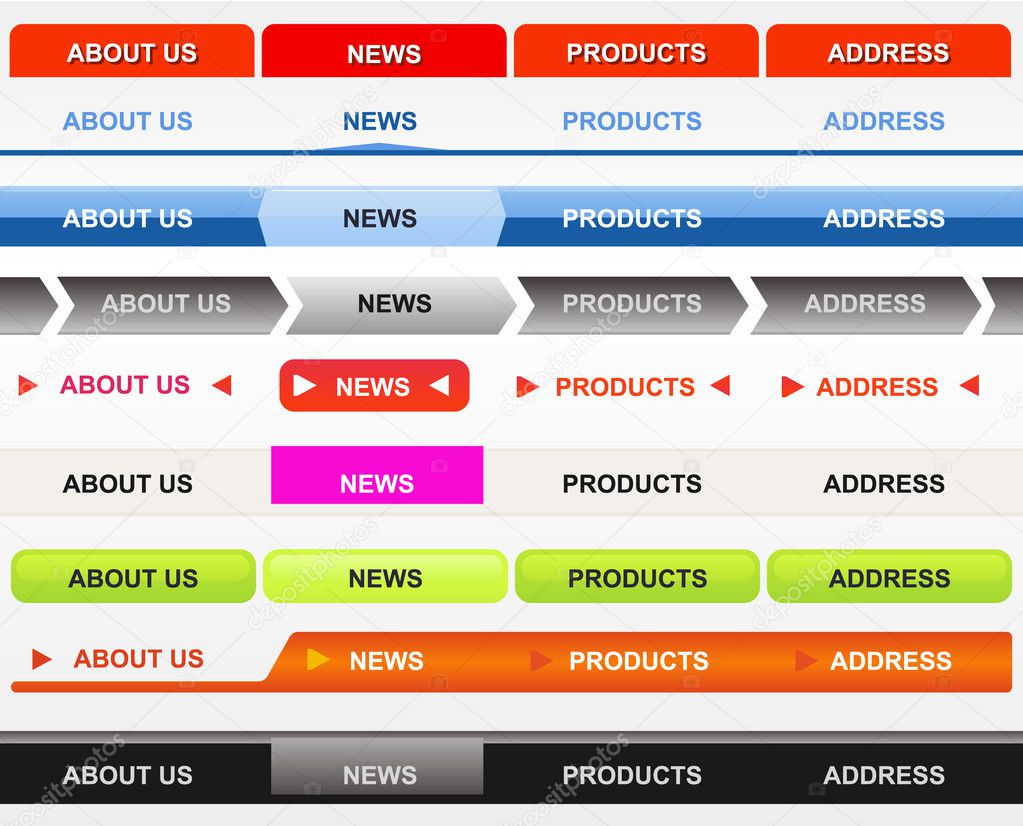
Crow skrev:hmm ok but how would you lets say make a differently shaped button or add an arrow pointing down similar to "kurser" and "kontakt" used on this website ?
i can easily create a box with a couple button's along with a hover function but shaping the button's and adding a picture like arrow next to the word, or shaping a field for the search engine, i am quite interested in how you can make that without in some what using Photoshop etc.
please enlighten me since i am still quite new to it all but i wish to learn as much as possible

All the following examples are very crude, and is just to give an idea of how you can achive the different effects.
The first one is pretty simple, something like this.
Kode: Vælg alt
<!--About us-->
    <div style="background-color: red; border-top-left-radius: 10px; border-top-right-radius: 10px; text-align: center; height: 50px; display: inline-block; display: table-cell; vertical-align: middle;">

        <a style="font-size: 25px;" href="#">About us</a>

    </div>
The second one is pretty close? Or something in that manner
Kode: Vælg alt
<div style="border-color: transparent transparent black transparent; border-style: solid; border-width: 0 80px 10px 80px; width: 0; height: 0px;"></div>
The third and fourth one i dont know on the top of my head.
The fifth one, one for each side (left and right)
Kode: Vælg alt
    <div style="border-color: transparent red transparent transparent; border-style: solid; border-width: 100px; width: 0; height: 0;"></div>
    <div style="border-color: transparent transparent transparent red; border-style: solid; border-width: 100px; width: 0; height: 0;"></div>
And for the rounded corners, set border-radius to 10px on the hover effect.
The six one is just a hover effect of pink, with a padding set from what i can tell.
The seventh one is just rounded corners of 10px or something like that, and a background-color of greenish.
Use a gradient effect to get something that looks like the same result.
Something in the line of
Kode: Vælg alt
background-image: -webkit-gradient(
	linear,
	left top,
	left bottom,
	color-stop(0, rgb(224, 251, 235)),
	color-stop(1, rgb(45, 252, 169))
);
background-image: -o-linear-gradient(bottom, rgb(224, 251, 235) 0%, rgb(45, 252, 169) 100%);
background-image: -moz-linear-gradient(bottom, rgb(224, 251, 235) 0%, rgb(45, 252, 169) 100%);
background-image: -webkit-linear-gradient(bottom, rgb(224, 251, 235) 0%, rgb(45, 252, 169) 100%);
background-image: -ms-linear-gradient(bottom, rgb(224, 251, 235) 0%, rgb(45, 252, 169) 100%);
background-image: linear-gradient(to bottom, rgb(224, 251, 235) 0%, rgb(45, 252, 169) 100%);
The eight one im not sure of, but i definitely know its possible with CSS3.
I know elements by default is cut at an angle, so if you stretch the border and hide the other 3. Maybe you can archive this effect?
No idea
Try it out.
The last one is the same as the six one. Hover effect with a padding set.
Hope the examples helps you with some of them.